Video Tutorial from the Deep Space Lecture
==========================================================
Where does it begin…..
==========================================================
Spacing from Web Design, begins with thinking about the fore-founders of page construction, often considered the “Canon of Page Construction”. They defined, what is considered the laws of form in 2 Dimensional Design. Similar to a chef’s secret recipe these page architects, kept their principles closely guarded and considered their exact execution to not be “good design” or “cool design”, but rather: PERFECTION.
The names of these perfectionists of design are: Jan Tschichold, J.A van de Graaf, Raul M. Rosarivo, and Hans Kayser. By utilizing the mathematical proportions of the page, they essentially divided the page into a structure for consistently creating eye pleasing results.
==========================================================
Two terms that are heavily leaned on in this pursuit are Margins, Gutters, and Padding:
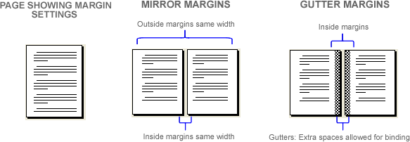
Margins = is the white space or white area that surrounds the content of a page.
Gutters = a trough in between the content areas or text areas, allocated for traditional book binding.
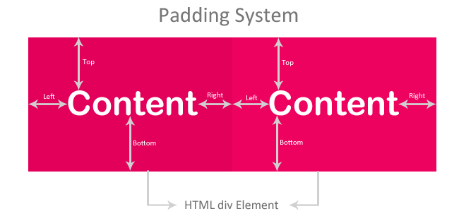
Another term heavily used in Web Design is Padding: Padding is the space from inside the border of the cell or block of content you have created (like a button). In this instance padding is the distance from the edge of this block to the text or the image in that content area.
================================================================
Let’s look a website entitled “Retina Art” that has some nice examples:
http://retinart.net/graphic-design/secret-law-of-page-harmony/
==========================================================
Three areas where spatial organization compliments web design are:
1. Creates Grouping
2. Creates Emphasis
3. Improves Legibility
==========================================================


