2. Creates Emphasis
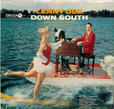
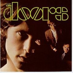
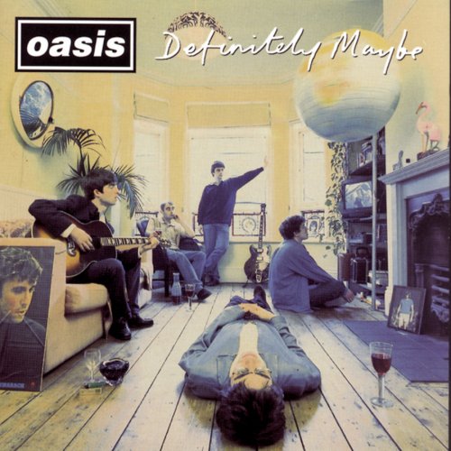
a. One way of creating emphasis is by playing with unequal spacing of objects… That is essentially looking at the blank canvas and positioning an object so that it is either more striking to the eye, less striking to the eye, or not completely symmetrical and boring to the viewer.
===========================================================
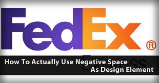
b. Another way to create emphasis is by utilizing negative space. Negative space is often called “white space”, although it does not have to be white. This is the opposite of the positive or the object of focus.
Here is are some examples of logos that utilize negative space:
===========================================================
Lets check out a nice article discussing NEGATIVE SPACE with Web Design from Layers Magazine.
===========================================================
WORKSHOP: SELECT A TOPIC WITH A PARTNER AND CREATE A DESIGN THAT UTILIZES NEGATIVE SPACE… THIS CAN BE A LOGO OR A PIECE OF ART…
HERE IS A VIDEO OF SOMEONE WHO MADE IT BY HAND WITH A SCISSORS:


