Essentially these fore-fathers were concerned with the organization of white space on the page… the execution of good white space accomplishes the following:
Creates Grouping
a. We have seen in the above example how the utilization of the canonical approach creates nice organization for grouping text and image areas.
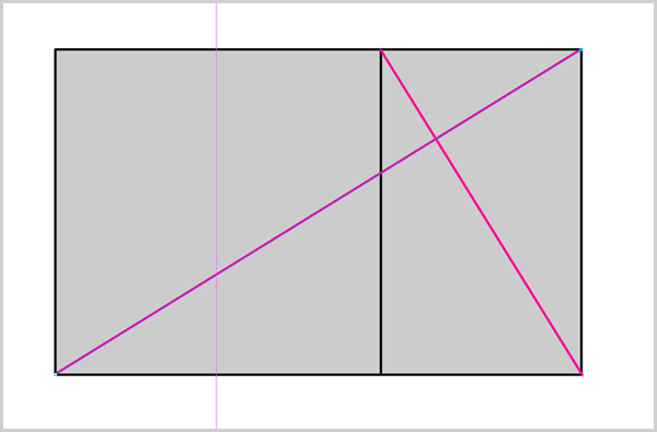
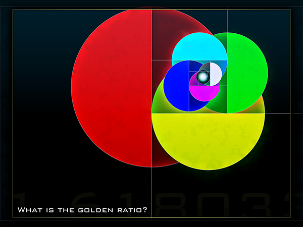
You can also utilize the “Golden Ratio” or “Phi” – by dividing the page width by the golden ration which is: 1.61803398875. You could then continue to use the golden ratio to create other areas of spacing as well…
Here is a nice website that outlines the utilization of the golden ratio in web design.
================================================================
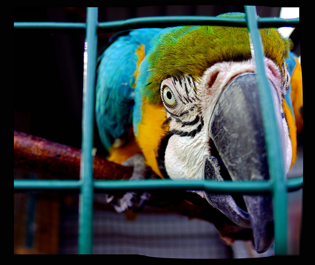
b. Photography likes to utilize the rule of thirds. The rule of thirds looks like this:
Essentially you break the image down into 3 parts both horizontally and vertically, trying to space out your imagery in a balanced manner.
This bird is trapped in the rules of thirds
================================================================
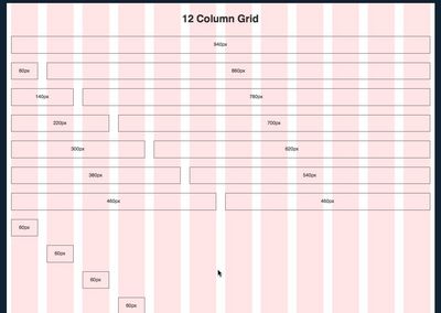
c. Other options for controlling white space are contemporary grid systems like 960.gs


