3. Improves Legibility
a. Font size is going to change relative to a browser, but in web design we can use the elements like “em” that will adjust to the size of the default in the browser, for font size you want to go for about 85% of the body font selected for the default… which provides about a 14 pixel font. I
b. A good standard for line spacing between other lines is 1.8 em (this is .8 larger than the default measurement for fonts on that persons browser, so it can be varied) or 1.8 for point size measurement.
Line height should be between about 140% – 150% from the font size you selected. For example: 12px font = 18px line height & 16px font = 24px line height.
When creating text and paragraphs of text many of these decision can be based on your preference, decisions, and point of emphasis. Although being cognizant of the text and placement of text is an important area of focus.
If you would like a detailed discussion on this you can follow this link…
or this website that breaks down the different font sizes related to all browsers
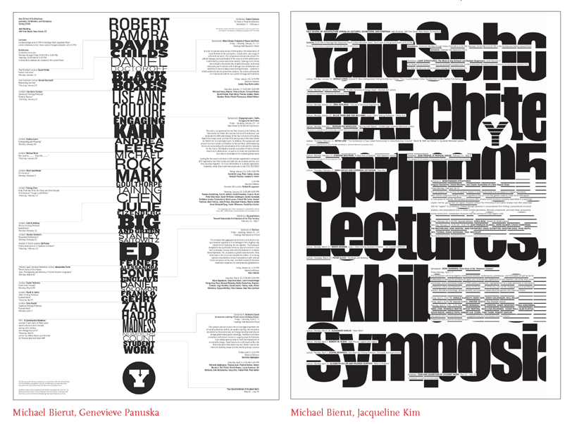
As a general rule: Straight edge or left alignment is good for paragraphs… &&
Centered is good for headings and small bits of test!!!
For more investigation we can look at “Thinking with Type”
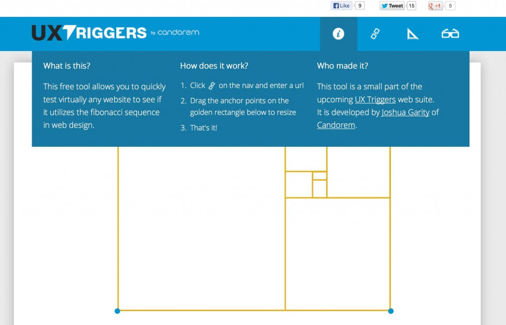
For more tips you can view the example sites and description by Joshua Garity
http://www.joshuagarity.com/web-design/the-golden-ratio/

===================================================================
PHOTOSHOP TUTORIAL ON THE GOLDEN RATIO
===================================================================
Deep Space from BCC Multimedia Arts on Vimeo.

